Ruth Rosenholtz
Applying Human Vision Research to Design of User Interfaces and Information Visualizations
All models are wrong, some models are useful.
G. E. P. Box Robustness in the Strategy of Scientific Model Building (1979)
It is no paradox to say that in our most theoretical moods we may be nearest to our most practical applications.
Alfred North Whitehead
Users are often faced with a large quantity of information, and the designer’s goal is to present that information in such a way that the user can make rapid and accurate decisions as part of their task. Critical to doing this is to understand the rapid, effortless, often veridical processing capabilities of the human visual system. Grounding human vision research in applications provides us with a rich source of interesting research questions, and gives a useful perspective on our work in human perception.
Our work in design of user interfaces (UI) and information visualizations (infovis) ranges from applying quantitative models to inform design, to more qualitatively applying rules of thumb we have learned about perception to design.
The quantitative models we work with include models of popout, texture segmentation, and visual clutter.
A Model of Perceptual Organization for Information Graphics
(Work done in conjunction with Nathaniel Twarog, Nadja Schinkel-Bielefeld, and Martin Wattenberg.)
More recently, we have been developing a simple and intuitive model of a range of perceptual organization phenomenon. This model can correctly predict percepts of text, graphs, maps, and so on.
Figure 1: (a) Original text, along with the perceptual organization algorithm’s predicted hierarchical grouping of letters (b), words (c), lines (d), and header grouped with lower paragraph (e). Each group is indicated by a different color.
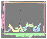
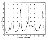
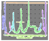
Figure 2: Variations on a graph (a, c, e) from Tufte (1983), along with the predicted contours (b, d, f, respectively).
Do Perceptual Predictions Aid Designers?
(Work done in conjunction with Amal Dorai and Rosalind Freeman.)
Designers traditionally learn qualitative rules-of-thumb for how to enable quick, easy and veridical perception of their design. More recently, work in human and computer vision has produced more quantitative models of human perception, like those described elsewhere on this web site. In a recent field study, we asked whether such models aid the design process. Through a series of interactions with designers and design teams, we found that the models can help, but in somewhat unexpected ways.
We went into this study expecting that perceptual tools could help by giving guidance on perceptual aspects of design. This does seem one likely role for such tools. Our predictions of visual saliency and clutter did facilitate observations about the perceptual goodness of designs, useful A/B comparisons between candidate designs, and successful redesign.
We found that the most powerful potential use of perceptual tools, though, is as a facilitator of conversations among multidisciplinary team members about design intuitions and design goals. By providing a common “perceptual” language, these tools may mediate communication across disciplinary boundaries. By providing a simple visualization of the design, thus providing a “guided tour” of the design, and facilitating conversations about goals, perceptual tools enlist participation, elicit comments, and lead teams into a problem-solving mode in which they can better work towards their design goals.
Using Qualitative Knowledge of Human Vision to Enable Better Web Search and Document Browsing
We know from a variety of researchers that humans are better at processing images than text. We faster at searching for pictures among pictures than words among words. We are faster at getting the gist of an image than reading a phrase. Our picture memory is better than our word memory. (See papers, below, for references.)
This insight led to work on searching the web with Enhanced Thumbnails and a related project for browsing documents. This insight was also at the core of work with collaborators J.P. Lewis and co at USC on automatically generated icons for use in computer file systems.
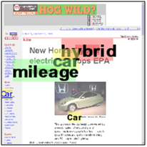
In the Enhanced Thumbnails project, we were interested in helping users search for a particular document among a large collection of documents, as when one searches using a web search engine like Google. Google presents search results using text summaries that contain the URL, the page title, and a snippet of text showing the relationship between a subset of the search key words. This scheme is reasonably effective. However, the ease with which our visual systems can process and search through images made us think that web search might be more efficient if the search engine displayed its results as thumbnail images of the web pages instead of text summaries. But plain old thumbnails lack any readable text, and in particular they lack any equivalent of showing the relative locations of the search terms. We thus created what we call “enhanced thumbnails,” which have the advantages of both text summaries and thumbnails.
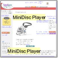
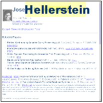
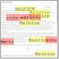
Figure 3: Examples of Enhanced Thumbnails. Headers are enlarged for better readability, search terms are enlarged, highlighted, and shown on top of their location in the first page of the document.
Enhanced thumbnails are plain thumbnails with enhancements such as text overlays to show the location of the search terms in the document. These text overlays were designed with knowledge of human vision in mind, to ensure that they were easily segmented from the background web page and easy to search for. Our user studies showed that users were on average 30% faster at web search tasks with our enhanced thumbnails than with current text summaries.
Next, we moved from the problem of how to aid search through multiple documents to the problem of how to aid browsing through a single document. When looking for information in a long document, it can be difficult to find the relevant part of the document. Search utilities, which allow the user to jump to a portion of the document containing a specified keyword, may help. However, when the interface jumps to a new part of the document, the user can get lost and be confused by the context. Search facilities also tend not to allow one to view the relative locations of several key words. To aid in document browsing, we designed what we call “Popout Prism.” This consists of an enhanced thumbnail of the document alongside the full document. The enhanced thumbnail acts as a scrollbar, allowing the user to page through the document. When the user enters keywords, text overlays appear on the thumbnail and also, initially, on the full document. The keywords then fade on the full document, so as not to interfere with reading. However, it can be difficult to transition between highlighted keywords on the thumbnail and the full view of the document with no highlighted words. Popout Prism eases this difficulty by having the highlighted words appear overlaid on the full document during document navigation (scrolling using the thumbnail scrollbar).
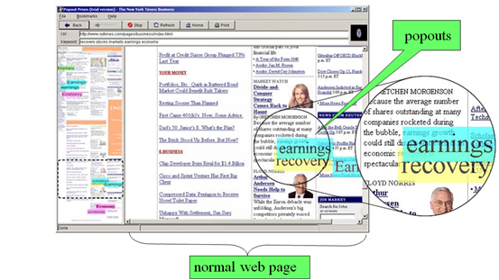
Figure 4: The PopoutPrism web browser. The left panel shows an overview of the web page, an enhanced thumbnail. The user can enter keywords, which are displayed as “popouts” over the overview and web page. The dotted rectangle shows location within the page, which can be moved to navigate through the document. Popouts disappear from the main page after several seconds, so they do not interfere with reading the document. The popouts reappear when the user scrolls the document using the overview thumbnail, to aid in navigation.
Bibliography
- Web pages: What can you see in a single fixation?Ali Jahanian, Shaiyan Keshvari, Ruth Rosenholtz, CR:PI 2018, 2018. Abstract PDF
- What your visual system sees where you are not lookingRuth Rosenholtz, Proc. SPIE: HVEI, 2011. Abstract PDF
- Do predictions of visual perception aid design?Ruth Rosenholtz, Amal Dorai, and Rosalind Freeman, ACM TAP, 2011. Abstract PDF
- What Your Design Looks Like to Peripheral VisionAlvin Raj, Ruth Rosenholtz, APGV, 2010. Abstract PDF
- An intuitive model of perceptual grouping for HCI designR. Rosenholtz, N. R. Twarog, N. Schinkel-Bielefeld, and M. Wattenberg, SIGCHI, 2009. Abstract PDF
- Measuring visual clutterR. Rosenholtz, Y. Li, & L. Nakano, Journal of Vision, 2007. Abstract PDF
- Feature Congestion: a measure of display clutterR. Rosenholtz, Y. Li, J. Mansfield, Z. Jin, SIGCHI, 2005. Abstract PDF
- VisualIDs: automatic distinctive icons for desktop interfacesJ. P. Lewis, R. Rosenholtz, U. Neumann, and Nickson Fong, SIGGRAPH, 2004. Abstract PDF
- Halo: A technique for visualizing off-screen locationsP. Baudisch & R. Rosenholtz, SIGCHI, 2003. Abstract PDF
- A comparison on the use of text summaries, plain thumbnails, and enhanced thumbnails for web search tasksA. Woodruff, R. Rosenholtz, J. Morrison, A. Faulring, & P. Pirolli, J. Am. Soc. Inf. Sci. & Tech., 2002. Abstract PDF
- Popout Prism: Adding perceptual principles to overview+detail document int erfacesB. Suh, A. Woodruff, R. Rosenholtz, A. Glass, SIGCHI, 2002. Abstract PDF
