The Visual System as Statistician
Applications
A fundamental constraint on our performance of visual tasks is what we can see in a single glance.
If an alert "pops out" and draws our attention, we can easily and quickly notice it even if we are not looking right at it. If a driver can quickly glance at her GPS system and tell that she is approaching a left turn, she will more effectively use her GPS than if comprehending the display requires several glances. A complex diagram, like a subway map, is unlikely to be fully comprehended at a glance, but in a well designed map, the viewer has adequate information for planning his next glance, and for piecing together his route.
The question of what our visual systems can perceive in a glance would be boring, except that processing is not uniform throughout the visual field. As a result, information available in a particular glance typically differs from the information available in the next. This phenomenon is precisely what forces us to glance around to begin with.
Considerable research has demonstrated that the representation is not equally faithful throughout the visual field; representation appears to be coarser in peripheral vision, perhaps as a strategy for dealing with an information bottleneck in visual processing. In the last few years, a convergence of evidence has suggested that in peripheral regions, the information available consists of local summary statistics. Given a rich set of these statistics, many attributes of a pattern may be perceived, yet precise location and configuration information is lost in favor of the statistical summary. This representation impacts a wide range of visual tasks, including peripheral identification, visual search, and visual cognition of complex displays.
For details, see Balas et al 2009, Rosenholtz 2011,Rosenholtz et al 2012 and Rosenholtz et al 2012.
We can create visualizations of the information available in a single glance.
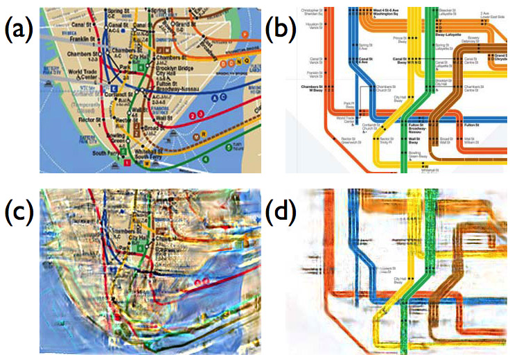
Why does most of the world prefer abstract subway maps like the one shown in (b), instead of the geographically more accurate traditional New York City map in (a)? Is the abstract map less cluttered, and thus more comprehensible at a glance? In (c), we show a "mongrel"of the map section in (a). Near fixation, the map is quite good, and it maintains much of its structure north and south of that point as well. However, beyond that the map is a mess!
What lines connect to the east, for instance? The mongrel in (d) is nearly a perfect replica of the original map in (b). It is uncluttered enough that the information available at a glance is rich and veridical, with an obvious exception of not being able to read the peripheral text. The visualizations in (c) and (d) enable insights without the difficulty attending to and introspecting on one's peripheral vision.

|
For details of this work, see Rosenholtz 2011.
What map information is available in peripheral vision?
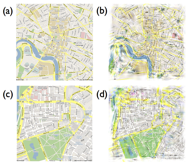
Looking at a map of Harvard University (a) and downtown Boston (c), and their mongrels given in (b) and (d) below, respectively, our model of peripheral vision predicts that quite a few of the major roads on a map are decipherable, at least where they are straight, sparse, and more grid-like. It is also possible to make out quite a bit of the curve of the river, the presence of a differently colored region in the middle, and the fairly salient pink areas on the right. The river and its neighboring parks on the far left may be harder to resolve when fixating the center of the map.
 |
Exact details of the minor roads, smaller parks and smaller regions are less perceptible. The representation does a good job of capturing the shape of the big park. Roads become difficult to interpret near the complex pattern of on-ramps and exits in the upper left. The exact pattern of lakes within the park is unclear.
Modeling and visualization techniques are good at providing intuitions like these, but they are slow enough to make it prohibitive to run on a large number of maps and get quantitative results. Therefore, we have turned to empirical studies to learn more about map perception in the periphery to see if we can validate some of the qualitative insights from this model.
To predict the utility of peripheral vision for map perception, we attempted to answer this question empirically.In an experiment, we asked what map details observers could identify and adequately describe in their visual periphery. Observers fixated on a cross at the center of a map and reported what they were able to perceive in the periphery of the map. We asked each participant several questions about each map, such as whether they saw any major roads, icons or bodies of water (a complete list of questions follows). Participants indicated, by pointing at the screen, the positions and outlines of these landmarks, while maintaining fixation.
We used 75 maps: five sub-maps from five cities in each of three map styles (Google, Bing, Popout). Bing and Google maps are standard electronic map styles and PopOut maps are a paper map series designed for tourist pedestrian navigation. By including PopOut maps we were able to explore the perception of maps designed for paper rather than electronic use, and a wider diversity of map styles. The cities were selected for their diverse layouts: Amsterdam, London, Paris, Seattle and Washington, D.C.
The results from our experiment were qualitatively similar to our intuitions from the mongrels. We summarize some of them here:
+ Participants reported on average 3.6 major roads and 1.5 more minor roads per map. If participants did report a major road, 83.9% of the time they could accurately trace its shape, where accuracy is defined by whether they indicated the angle of the road and any major turns.
+ Participants sometimes reported non-roads as a road. Two participants misidentified Amsterdam's canals as streets and there were a number of errors where participants identified aligned features as a road. For example, participants might report that the edge of a park, a piece of road, and the edge of a body of water make up one long road.
+ On average, participants identified 70.6% of major bodies of water at 2-10 degrees eccentricity and 44.4% at greater than 10 degrees eccentricity. Similarly, for major parks, participants on average correctly identified 69.3% of major parks at 2-10 degrees of visual angle and 39.5% at greater than 10 degrees of visual angle.
+ However, participants sometimes missed major parts of park boundaries when tracing their shapes. On average, for 31.6% of identified parks, participants traced a park boundary that excluded over one-quarter of the park's area. For instance, when tracing the National Mall and Memorial Parks in D.C., many participants ignored the area with the White House and Ellipse. As with major roads, they also some-times misidentified other features as parks or bodies of water.
Details of this work will be available in Gustafson et al (in prep).
Can you see who signed on to chat as you are composing a new email?
 |
 |
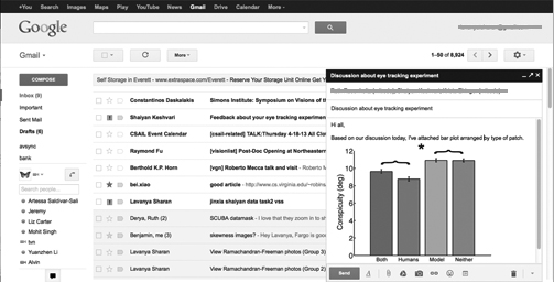
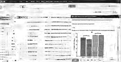
Running our model on a screenshot (top) of the user's Gmail browser page reveals (bottom) that the user can easily distinguish the unread messages at the top of the inbox and the search box at the top of the browser page but not the Gchat contact list or the Gmail folders list on the extreme left. Note that the user's email address on the top right of the browser window and addresses in the "TO" field in the the new message compose window have been concealed in gray to protect privacy; this was done after the mongrel image was generated and hence the gray line does not appear distorted.